


When you work with youth, design needs to do more than inform — it needs to resonate.
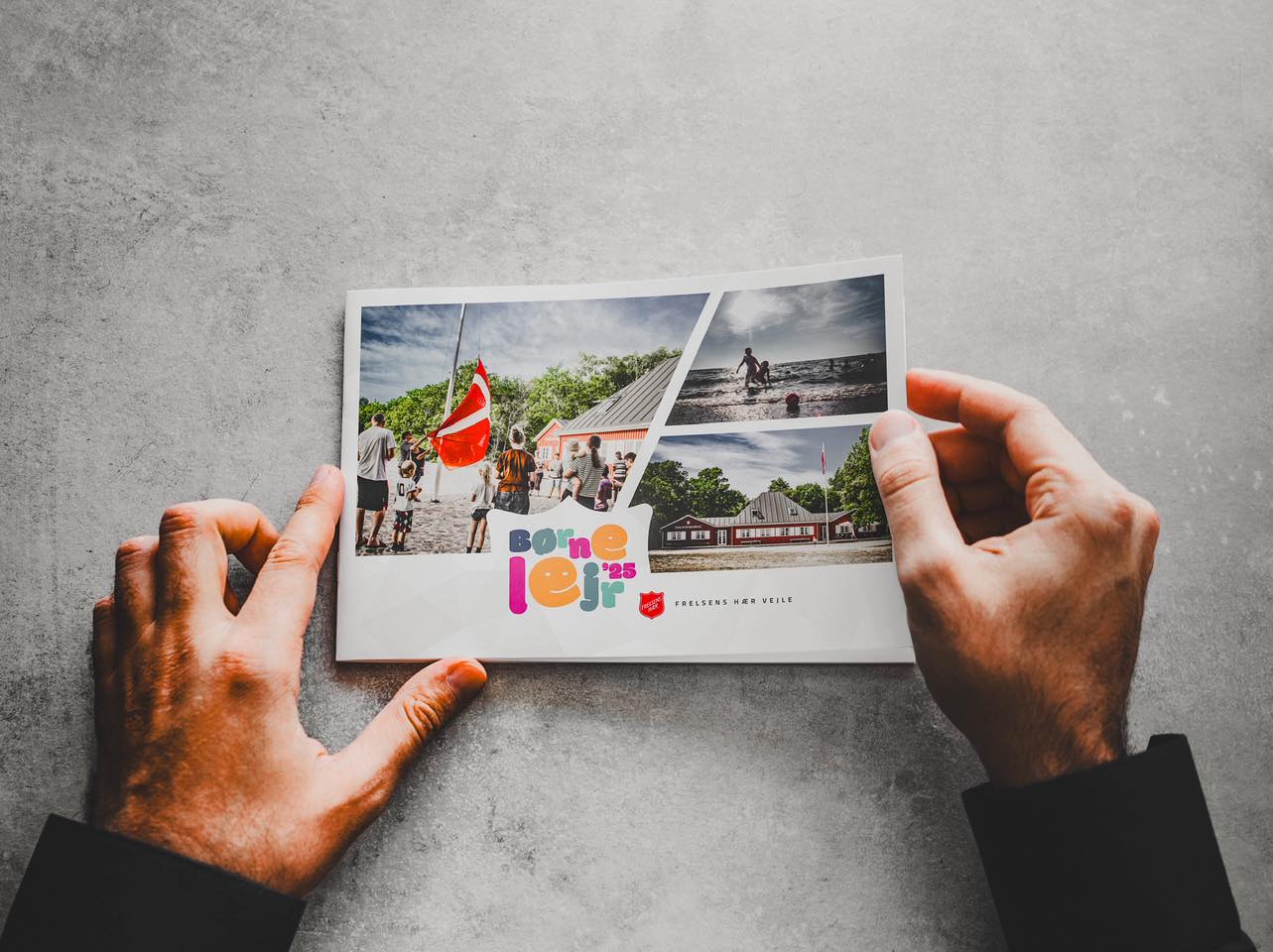
For The Salvation Army Vejle’s 2025 summer camps, I created two visually engaging photo booklets: one for TeenLejr (teen camp) and one for BørneLejr (children’s camp). Each booklet captures the spirit of the week — the community, the joy, the purpose — in a format that participants can hold onto long after the tents are packed down.
The design approach was distinct for each age group:
• TeenLejr 2025 leans on bold typography, muted grayscale textures, and strong photo compositions to reflect energy, identity, and teamwork.
• BørneLejr 2025 uses playful lettering, bright colours, and beachy, sunlit imagery to capture a sense of wonder and joy.
Both booklets were produced as small-format prints with a landscape orientation for easy browsing. They serve as memory books, conversation starters, and visual documentation for families, volunteers, and future participants.
For me, this project wasn’t just about layout — it was about designing belonging.
This website can load fonts from Google. This connects your browser to Google’s servers and shares your IP address. You can accept or reject Google Fonts, or manage your preferences. If you reject them, the website will use a fallback font.