
At The Salvation Army in Vejle, communication isn’t just about announcements — it’s about building rhythm, relationships, and recognisability.
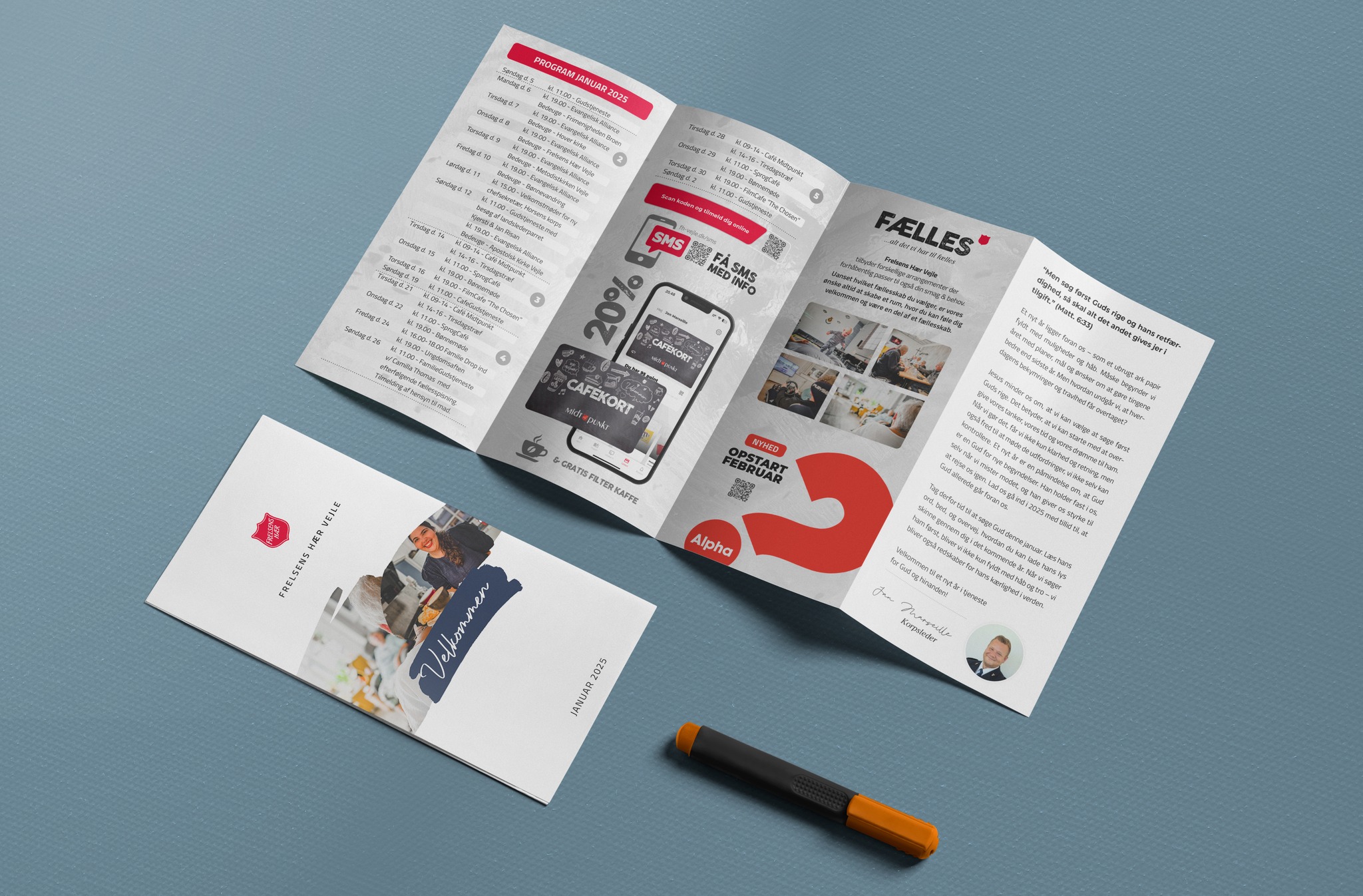
Every month, I design a folded A4 brochure that serves as a four-panel printed programme. It’s handed out at events, displayed in the café, and used in outreach — a tangible piece of communication that feels personal, structured, and welcoming.
Each edition includes:
• A full monthly calendar of events
• Inspirational messages and spiritual reflections
• Highlights of key activities and initiatives (e.g. our café loyalty card or Alpha course)
• QR codes linking directly to our digital platform
The printed brochure is not a standalone product — it works in tandem with our Digital Connection App → view here. While the print version offers presence and visibility in physical spaces, the app provides flexibility, live updates, and event registration. Together, they form a hybrid communication strategy that meets people where they are — offline and online.
Designing for both formats means thinking in systems: consistent visual identity, intuitive hierarchy, and adaptive content. It’s not just about looking good — it’s about being useful, month after month.
This website can load fonts from Google. This connects your browser to Google’s servers and shares your IP address. You can accept or reject Google Fonts, or manage your preferences. If you reject them, the website will use a fallback font.